Most IT dashboards overwhelm CEOs with data that does not drive decisions. Alert counts, real-time system metrics, and vanity statistics create noise that obscures actual risk.
Your IT dashboard should answer executive questions, not technical ones. It should clarify financial exposure, operational risk, and business unit vulnerability. If reviewing a metric never prompts action or resource allocation, it does not belong on your dashboard.
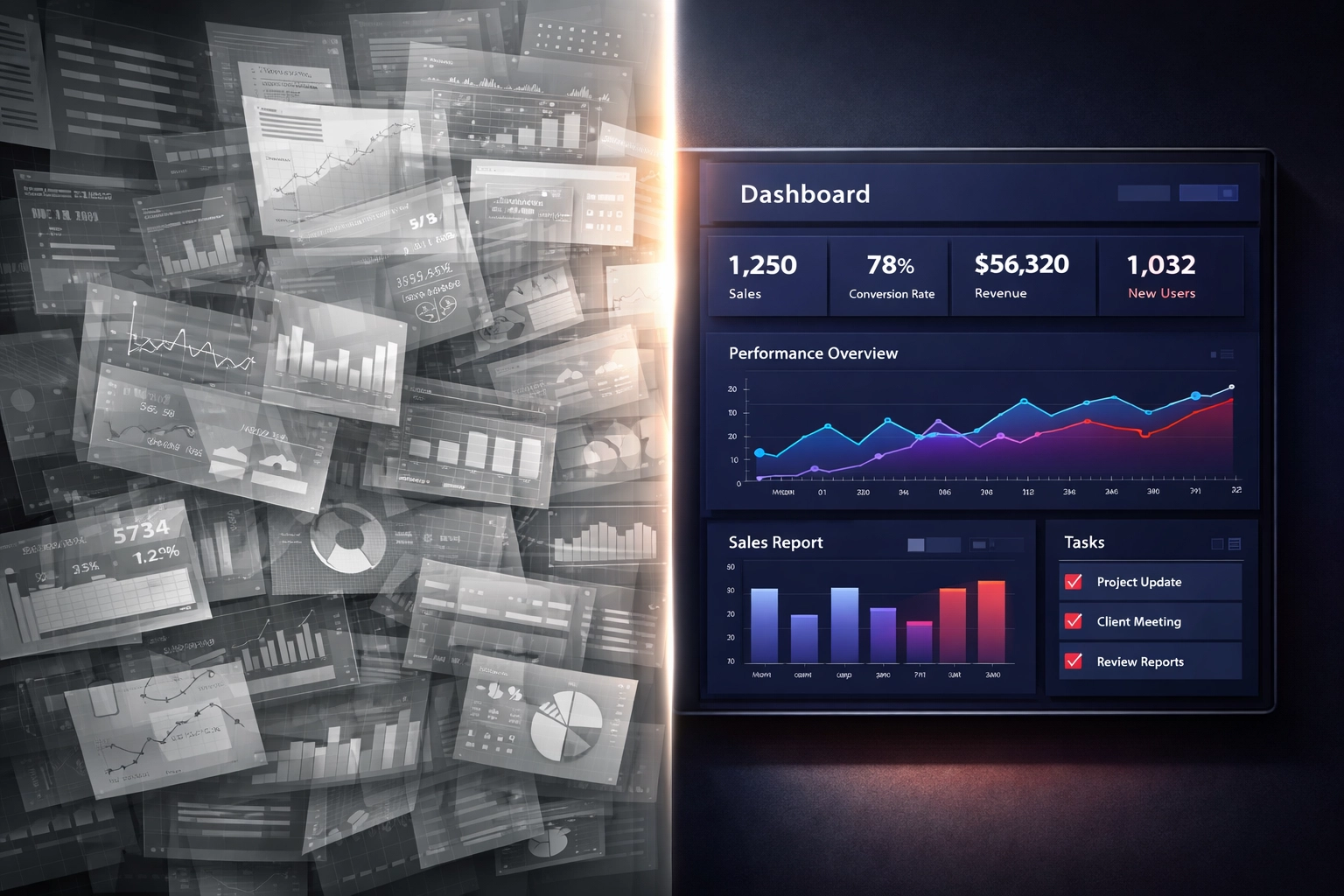
The Problem With Most IT Dashboards
Most business IT services companies build dashboards that reflect operational activity, not business impact. They show patch compliance percentages, help desk ticket volumes, and network uptime statistics without translating those numbers into exposure or accountability.
This creates two problems.
First, it forces CEOs to interpret technical data without context. A 92% patch compliance rate means nothing without understanding which 8% remains vulnerable and what systems or business units face risk.
Second, it trains leadership to ignore the dashboard entirely. When every metric looks like background noise, critical warnings get lost. Executives stop checking. IT becomes a black box until something breaks.
A business IT support services provider should deliver visibility that supports governance, not just system monitoring.

What Risk Actually Looks Like on a Dashboard
Risk is not an alert count. Risk is the gap between what your business depends on and what your infrastructure can protect.
Effective IT dashboards translate technical conditions into business outcomes. They show which revenue-generating systems face exposure, which operational areas lack redundancy, and where compliance gaps create financial or legal liability.
This requires your business IT services company to understand your business model, not just your network topology.
Risk-focused dashboards answer questions like:
- Which business units face the highest exposure today?
- What is the organization's top operational or security risk this week?
- How is that risk trending over time?
- What would failure cost in downtime, data loss, or regulatory penalties?
- Which systems lack acceptable backup or recovery capability?
These are executive questions. They require context, prioritization, and financial framing. Raw technical metrics cannot answer them.
Why Modern Threats Demand Better Dashboards
AI-enabled attacks and automated credential abuse have changed the threat landscape. Attackers no longer need weeks to compromise systems. They use stolen credentials, phishing kits, and automated tools to move laterally through networks in hours.
This speed means that traditional lagging indicators: monthly patch reports, quarterly vulnerability scans: no longer provide adequate warning. By the time those reports surface, an attacker has already exploited the gap.
Your dashboard must show real-time exposure in business terms. It must flag credential risks, endpoint gaps, and unpatched vulnerabilities in systems that matter to revenue or compliance.
Cybersecurity threats now move faster than most IT reporting cycles. Your visibility must keep pace.

What CEOs Should See
Your IT dashboard should focus on three areas: financial exposure, operational continuity, and compliance risk.
Financial exposure includes the cost of downtime, the value of data at risk, and the potential penalties from regulatory failures. It answers the question: what would a breach or outage cost this business?
Operational continuity tracks backup integrity, disaster recovery readiness, and redundancy for critical systems. It answers the question: can we recover if something fails?
Compliance risk monitors gaps in data protection, access controls, and audit readiness. It answers the question: are we exposed to fines, lawsuits, or regulatory action?
These three areas connect IT performance to business outcomes. They give leadership the information needed to allocate resources, approve investments, and manage board-level risk.
What to Ignore
Volume-based indicators create the illusion of insight without providing clarity. A high number of security alerts does not tell you whether those alerts represent real danger or false positives. A low number does not mean your environment is secure.
Real-time operational data such as minute-by-minute network traffic or help desk ticket fluctuations triggers knee-jerk reactions without revealing underlying trends. If you need smoothing techniques or 12-month trailing averages to make sense of a metric, it does not belong on an executive dashboard.
Vanity metrics look impressive but never drive action. System uptime percentages, total users supported, and patch SLA numbers in isolation do not inform decisions. If you have never changed a budget, timeline, or priority based on a specific metric, remove it.
Excessive data points dilute the signal. Every metric on your dashboard must answer a decision-making question. If it does not facilitate action, it contributes to noise.
This is where many business IT services companies fail. They add metrics because they can, not because those metrics inform leadership. The result is a dashboard that confirms systems are running but provides no visibility into risk.
Practical Guidance for CEOs
Ask your business IT support services provider to explain the dashboard in business terms. If they cannot translate a metric into financial exposure, operational impact, or compliance risk, question whether it belongs.
Key questions to ask:
- What is our top IT or security risk this month, and what is the financial exposure?
- Which business units or revenue-generating systems face the highest vulnerability?
- How do you prioritize remediation when multiple risks exist?
- What would it cost us if this system failed today?
- Are our backups tested, and can we recover within acceptable timeframes?
- Which compliance gaps exist, and what penalties could result?
Require your IT provider to present data in narrative form. A percentage or count without context is not actionable. Narrative intelligence explains what the number means, why it matters, and what leadership should consider.
Warning signs that indicate poor dashboard design:
- You review the dashboard but never change a decision based on it
- Metrics require technical interpretation before they make sense
- Data is presented without context, trends, or business impact
- The same metrics appear month after month without variation or insight
- Your IT provider cannot explain how a specific metric connects to business risk
If any of these apply, your dashboard is contributing to noise, not visibility.
Why This Matters for Governance
Boards and leadership teams are accountable for risk oversight. That accountability requires visibility into how IT decisions affect business continuity, data protection, and regulatory compliance.
A dashboard that shows only system performance does not support governance. It does not clarify accountability, prioritize risks, or connect IT investments to business outcomes.
This is why businesses work with partners like CMIT Solutions. IT governance requires more than monitoring. It requires translation, prioritization, and advisory support that connects technical conditions to executive responsibility.
Your business IT services company should function as a risk interpreter, not just a service provider. They should deliver visibility that supports board reporting, audit readiness, and decision-making at the leadership level.
What Effective Dashboards Deliver
An effective IT dashboard reduces uncertainty. It clarifies where exposure exists, what trends demand attention, and which risks require immediate action versus monitoring.
It allows leadership to answer questions from boards, auditors, and stakeholders with confidence. It supports resource allocation by showing where investment reduces risk or improves continuity.
Most importantly, it removes the guesswork. You know what is protected, what is not, and what failure would cost.
That level of visibility does not happen by default. It requires intentional design, business context, and an IT partner who understands that dashboards serve leadership, not just operations.
Moving Forward
If your current IT dashboard feels overwhelming or irrelevant, that is a signal. Either the metrics are wrong, or the context is missing.
Start by identifying the questions you need answered. What keeps you accountable to your board? What risks would you want to know about before they become crises? What financial or operational exposure do you need to track?
Then ask your business IT support services provider to build a dashboard that answers those questions. If they cannot, that is a different kind of signal.
This is worth addressing before it becomes urgent. Visibility is not a luxury. It is a governance requirement. If this is something you want to understand better, start with a conversation.